
Type Figure
The objective of this assignment was to pick some sort of figure and recreate it with type in an Adobe program. The type had to be a phrase between 5 and 7 words, could not be warped in any way, but could be resized. While we were encouraged to use pictures we had taken, public domain images were allowed to. This assignment was completed in sections, first using tracing paper to find ways to arrange the type we liked before moving on to recreating it on the computer.

Final Design
Research


Brainstorming


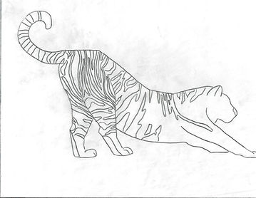
I chose to start with these four images as options. The two tigers and the Atlas moth were found on Unsplash. The picture of the girl was taken by my mom when I was a kid.
Tracing


Blocked Type Figure #1
I ended up vetoing the two tigers because I couldn't figure out a good way to do the stripes. The Atlas moth is my favorite and I felt it had a lot of good sections I could use to my advantage, so I chose that to be my first picture to try. The phrase I chose to use is "A thousand suns that taste like sugar," which is part of the poem "Kinder Than Man" by Althea Davis.


Blocked Type Figure #2
The second figure I chose to really work on is me as a kid at the beach playing some sort of tennis-like game with my dad. My mom is the one who took the picture. The phrase I picked here is "If there's a will there's a wave," but realized after there's probably too many similar words. However, it didn't really matter as I ultimately decided to go with the Atlas moth.


Computer Area Study #1
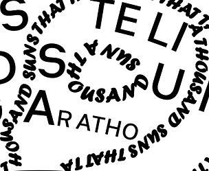
This first area study followed a solid black dot on the wing. The other dots were white so I simply outlined them with text. I didn't want to do the same with this one as it is a different color. I tried four different versions before ultimately deciding to go with the fourth one (bottom right) because I felt it's what looked best. I also went with the font Forte so it wouldn't blend in with the font used on the wing sections, and matched the other dots on the wings.


Computer Area Study #2
The second area study was essentially the whole wing itself. I was satisfied with the outlines I had done, but the sections of the wings ultimately ended up lost. My second attempt was to not follow the sections of the actual moth image but to make my own, and make them thinner so the text could be smaller and fit better around the wing patterns. This worked out well so I used the same technique for the rest of the wings.


B&W Progressions
With the type figure completely done on the computer, I printed it out to see if any mistakes could be spotted or any changes needed to be made. Some of the letters came out too big or cramped, so I circled them to be fixed. After fixing them on the Illustrator document, I printed the figure out again and found no more changes were needed.

Final
Here is the final project! The font used for the outline is Forte, which I chose because I thought it looked pretty. The font used for the inner wing sections is Heimat Sans SemiBold. I chose this font because it was created by Atlas Fonts, which I thought would be funny considering the moth I chose is an Atlas moth.

